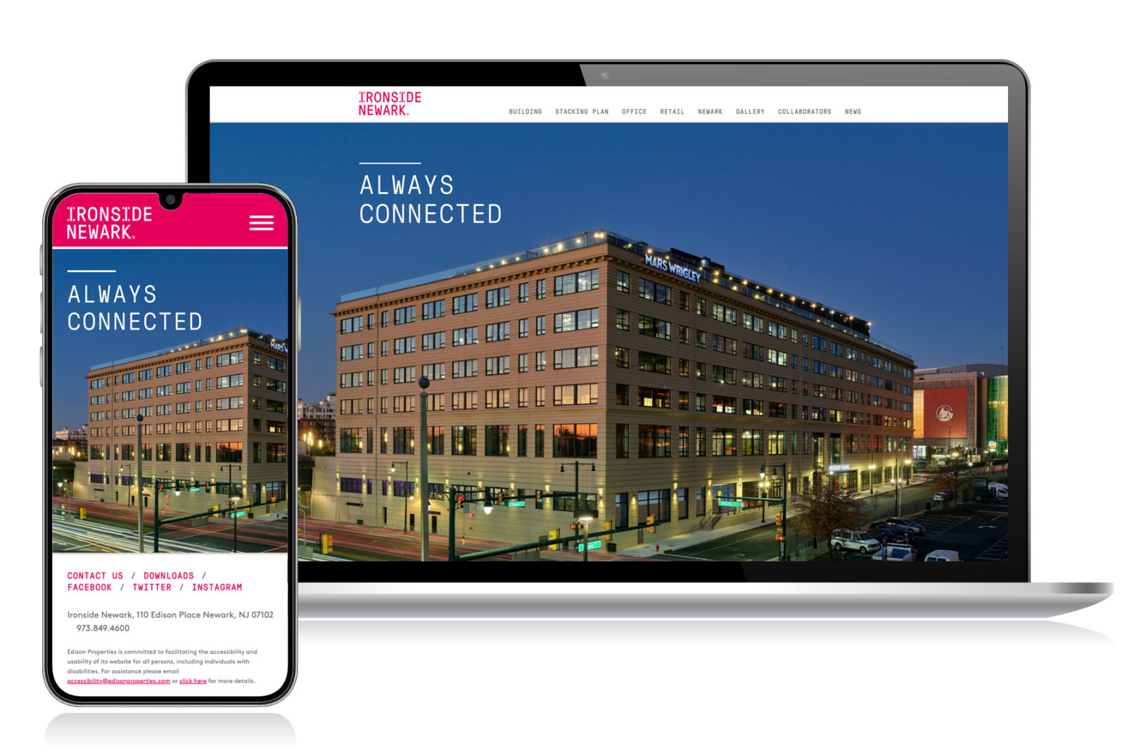
Ironside Newark
Website Redesign
Description: When Ironside Newark wanted to improve their UX, they looked to me. The goal was to simplify the site and make it less confusing for a user to navigate. By focusing on a mobile-first approach, making it accessible, and organizing the content into more appropriate sections with clearer page titles, the business was able to help lease the space, including attracting Mars Wrigley to establish its global headquarters there. Visit Website
My Role: Art Direction, UX

